Expertise connected to evidence
Expertise pages explain the journey from idea to prototype and production; project records show where those capabilities take shape.
Client project · design and production
A website connecting design, production techniques and a project portfolio.
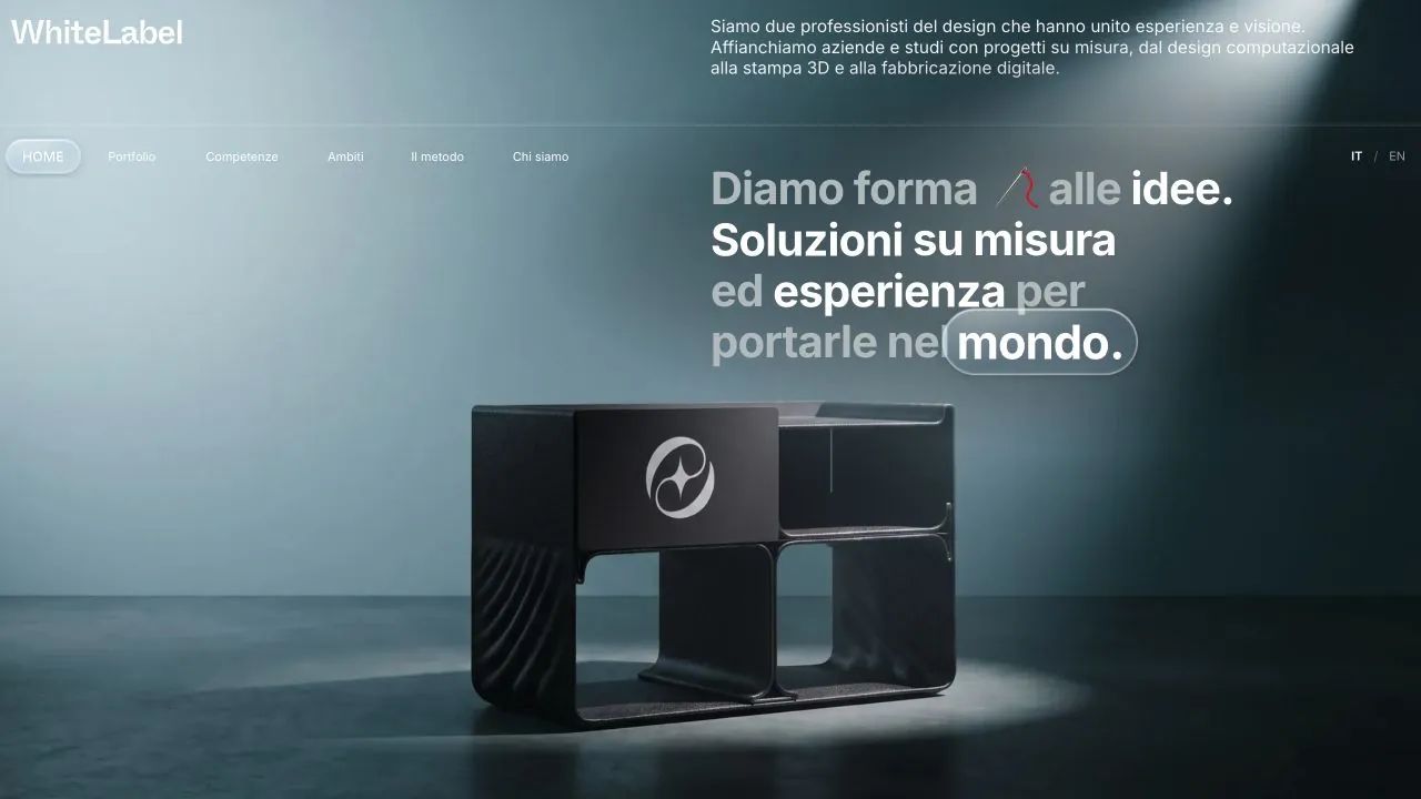
WhiteLabel combines design, 3D printing and digital fabrication. Its website needed to explain these skills to visitors starting from an idea or a production need, connecting the method, application areas and completed work.
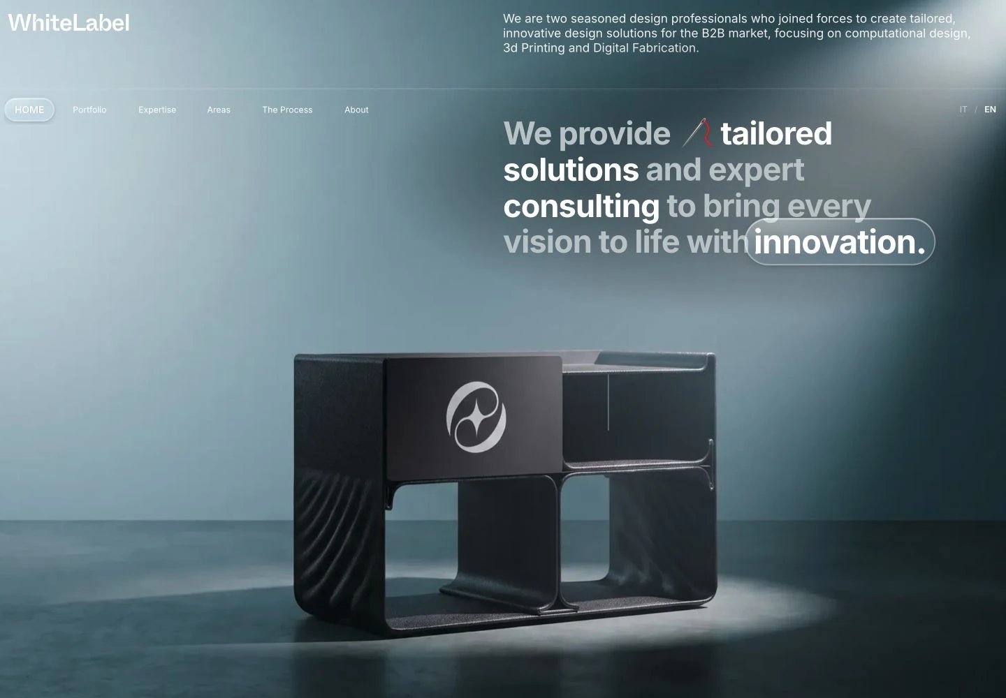
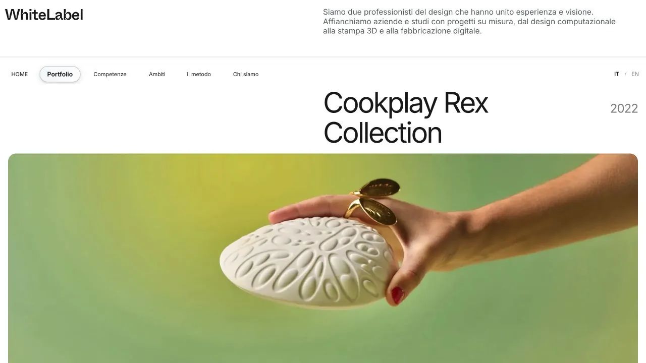
I handled project management, design and development. The journey separates Portfolio, Expertise and Areas, with Italian and English content. Skeuomorphism translates physical objects into the interface: the introduction animates the brand as material taking shape, while frosted glass, reflections and a lens-shaped pill give depth to navigation and introductory headings.
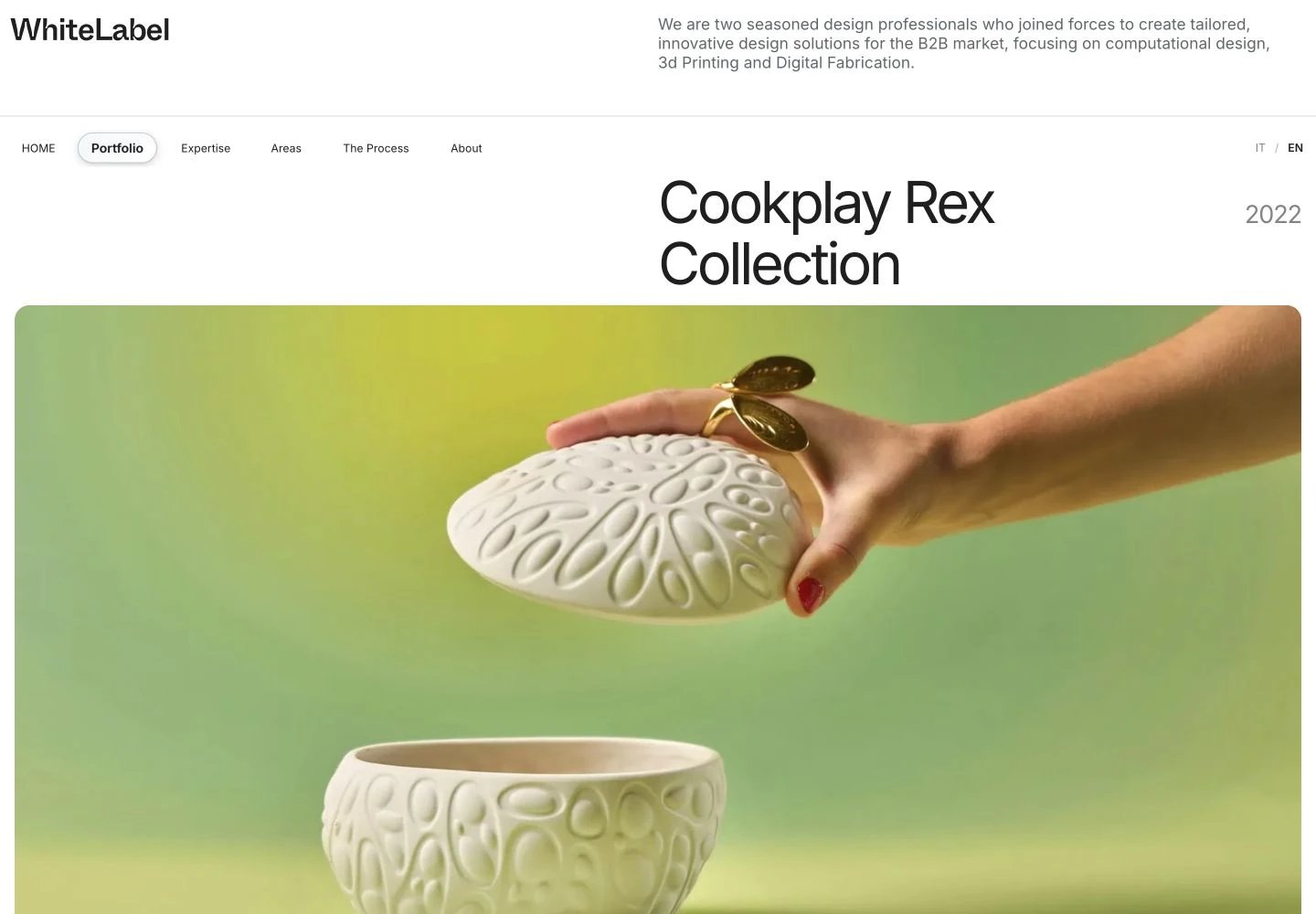
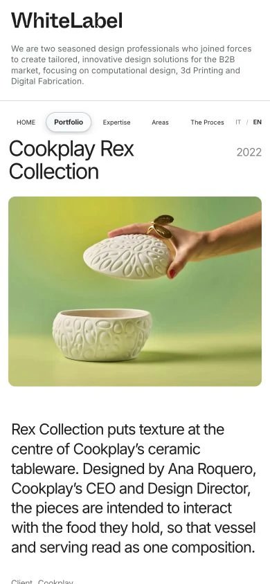
The project includes an immersive homepage, dedicated design, prototyping, production and AI to Product pages, and portfolio records with imagery, processes and credits. Cookplay Rex Collection shows how the website distinguishes product design, 3D modelling and engineering. My contribution is the website; products and their contributions remain attributed to the professionals named in each record.
Expertise pages explain the journey from idea to prototype and production; project records show where those capabilities take shape.
Cookplay, KEF and ReCircle Bench appear with context, imagery and credits. The website makes WhiteLabel’s contribution within collaborations clear.
The introductory halftone loops continuously; adjust frosted glass diffusion and drag the pill along the menu items, snapping to the nearest one: three specimens of the same visual system.
Material and optics become a navigation language. Animated halftone forms and disperses the brand; frosted glass retains a connection with what is behind it; the lens magnifies and refracts words in page introductions. Section colours and quieter surfaces support readable text, images and credits.
Colours, typography and rules of the project.
#FFFFFFPortfolio and project pages#191919Text on light surfaces#F6E330Expertise page#EDF3F5Areas page#203238Text on the Areas page#142B31Opening scene backgroundIdentity and interface details
Form, material, light.
Introductions, portfolio and body
From design to product.
A field of dots forms the brand, holds its readable shape and then disperses, opening onto the product scene. The introduction can be skipped and respects reduced motion.
Blur, transparency, a luminous rim and inner reflections suggest thickness. Imagery remains visible beneath the material without overwhelming its content.
The capsule moves across introductory words, magnifying them and refracting their edges. The same optical language identifies the selected menu item.
References: project interfaces, identity and materials.
Three specimens to explore: the introductory halftone, frosted glass and a pill that becomes a lens.

The halftone gathers into the brand’s contours, then disperses again. The opening sequence repeats in a continuous loop.
Transparency, blur, edges and reflections suggest a material. Adjust the frosting and observe the image underneath.
Click a word or drag the pill
Click an item or drag the pill to move between words, as in the WhiteLabel menu. The pill follows movement along the menu and snaps to the nearest item on release, magnifying its text.
Specimens derived from the original project components. With reduced motion, the introduction shows the brand without animation and the lens changes position without a transition.
Tell me what you want to build or which task you want to simplify. Our first conversation helps clarify goals, priorities and the information needed for a proposal.
emanuele@cardinali.studioMessage me on WhatsApp+39 329 154 6295You can get in touch while the idea is still taking shape. I will reply by email to understand the request and agree on the next step.
One studio, many worlds. Take a look at the other services too.